Your website header is often the first impression your company gets to make on visitors to convince them to head down the path to becoming a paying customer. As a young company, you may not have the time, tools or expertise to A/B test the way more established companies do. But by looking at several examples, we can learn from their approach and be inspired to create content that resonates, keeping in mind these 3 components:
- Website Headline and Subtext Copywriting.The headline should be concise yet descriptive about what you offer and who your offerings are for.
- Website Header Imagery. Choosing a header image can be challenging, and is often more time-consuming to create than copywriting. We’ll provide examples of different approaches that require varying levels of effort to produce.
- Call to Action. This is the key point of conversion. The prompt for users must be obvious, concise and convey clear value to entice them to click.
Static Text & Imagery
Complexity: Low
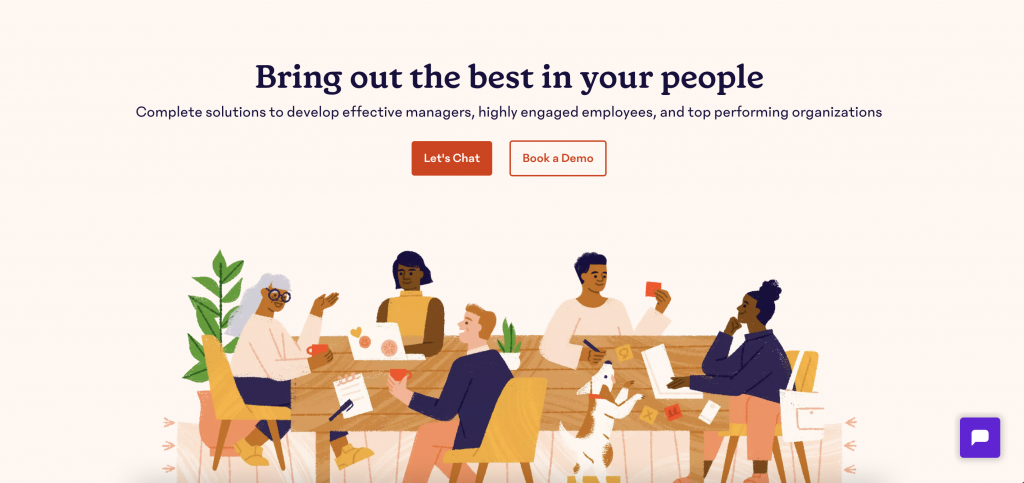
15Five’s website header is the most straight-forward approach to creating a website header. Static imagery involves no additional animation, which means less work for visual designers and developers to produce.
Copywriting: The content is succinct. The headline does a good job explaining the primary benefit for their general audience. The subheading includes more specific cues as to the benefits for the various audience segments they serve.
Imagery: Choosing to use hand-drawn illustration automatically creates a warm, welcoming feel. The content and style of the illustration reinforces a friendly vibe, in addition to the color palette, soft textures, playfully skewed perspective, and inclusion of endearing details like stickers on a laptop, people speaking with hand gestures and a dog. The illustration shows several people together in a communal space, and engaged in their own activities. Because each character is given a unique look, it supports the sentiment in the copywriting very well.
Call to Action: “Book a Demo” is a very common offering to give people a taste of the service or product your company offers before they buy. While there are many ways to phrase this, the way it’s worded here sounds friendly and casual, and implies that you will be able to select a time that suits your schedule once you click. “Let’s Chat” continues the approachable, conversational tone, so that even though this will lead to a sales call and, likely, several follow-up emails, it feels at first like a short, simple conversation that you chose to instigate.
Other notes: Notice the use of the chat in the bottom right corner to draw in users. The helpful, conversational tone is also used here to pose a question that makes the visitor feel in control of the situation. With all of these pieces working together, the brand personality comes across as friendly, welcoming and accommodating—something you may be looking to achieve for your company as a if you’re in their target user group.
Static Text with Abstract Animated Background
Complexity: Low
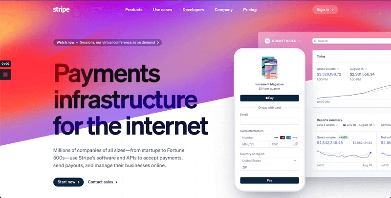
Stripe’s web team takes a masterful approach, using simple, subtle details to create a sophisticated presentation. Here, they display minimally illustrated product images overlaying an abstract lava-lamp-like background. This ties in nicely with a curious headline that begs visitors to take a closer look. Pretty graphics don’t necessarily tell the full story, but the overall effect makes for an imaginative intro to what could otherwise be a stodgy presentation for a payment processing tool.
Copywriting: The headline is succinct yet broad enough to encompass multiple use cases. The subheading follows up quickly with specifics to add dimension to the headline, including the target audience (all size companies, from startups to Fortune 500s), their breadth of offerings (software and APIs) and specific use cases (accept payments, send payouts, manage business online).
Imagery: Sleek screenshots, bright colors and bold text create an elegant, modern backdrop that only gets better as you explore the website. The angled background combined with the semi-transparent screenshot add an extra touch of sophistication that sets it apart from your garden variety SaaS company websites.
Call to Action: “Start Now” is a vague primary action to take, but isn’t so uncommon these days. Clicking on it takes the user directly to a form to create a new Stripe account. It’s interesting to note that unlike other service platforms, they don’t emphasize a “free” account, and encourage users to “Contact Sales” as a secondary action rather than schedule a demo.
Other Notes: Stripe’s website is full of delightful imagery and microinteractions that elevate it above companies even more established than they are. The level of organization and attention to detail reinforces a feeling of trust and reliability that is essential to uphold in a financial product.
Animated Text with Static Imagery
Complexity: Low
Auth0’s approach to a website header design requires more time and coordination to conceive, but is fairly simple to produce. The minimal imagery is likely just a stock photo that was popped into place. However, the copywriting snippets were well orchestrated, and a developer was needed to create the custom animated text.
Copywriting: The content is succinct and includes variations on a strong core theme. The first of the series of rotating headlines does a good job explaining the primary benefit for their general audience. Subsequent audience segments and benefits are represented in the headlines that follow.
Imagery: The focus is rightly on the copywriting, so imagery takes a backseat to avoid distracting the visitor. The plain background taking up most of the screen gives plenty of room for the featured text of varying lengths to display prominently on the left side. On the right, a simple abstract pattern provides just enough visual interest to keep the website header from feeling unfinished or boring.
Call to Action: It’s a little confusing to have 2 forms with different fields to input content into. But the premise is clear enough—if you want to “Get Started” with Auth0, you need to provide your email address and/or a password to secure your account.
Other Notes: Overall, the brand personality feels serious and focused, albeit a little sterile because of the austere visuals. A mostly gray and black header is saved by little pops of color and a modern-looking 3D pattern. All in all, they strike the right tone for a company that is focused on providing security for various user types, and the strong copywriting carries that message through loud and clear.
Animated Text with Rotating Imagery
Complexity: Medium
Airtable’s approach to their website header design requires more time and coordination to conceive and produce, but with less payoff than Auth0’s simpler execution featured above. The rotating images and animated text aren’t essential to get Airtable’s point across, but it might feel more robust because there are multiple moving parts. It requires more copywriting snippets, more images and some amount of custom development to create the animated text and image carousel.
Copywriting: The headline rotates out one word at a time, but doesn’t add additional context for what they offer. The subheading repeats the vagueness expressed in the heading. Auth0’s animated header text, shown just before this example, is arguably a much stronger concept for showcasing the variety of their offerings and target users while still centering around their primary function of security.
Imagery: The three photos featured don’t do a lot to show us about the company personality or what they offer and to whom. They look like stock photos of people staring at computer screens. The photos lack the originality or specificity that could have provided more context for their already vague copywriting.
Call to Action: “Sign up for Free” is the clearest copy written in this header. However, because there are no additional contextual clues for the value of this offering, people still may pass on this “free” experience until they’ve dug in more.
Other Notes: Overall, this approach is a lot of work for little payoff—their attempt to show variety still leaves us with a vague feeling about what they offer. This kind of execution is often a result of a lack of alignment among internal stakeholders with conflicting opinions, and is seen as a compromise. Carousels are usually requested by stakeholders who don’t want to feature a single idea in the header for fear of appealing to fewer people. However, featuring a carousel runs the risk of losing visitors because it can slow down the website load time, and users may scroll past the carousel message that was meant to target them.
Animated Text & Illustration
Complexity: High
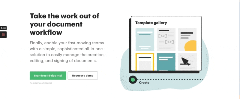
With a catchy heading and fun, informative animations, PandaDoc provides a wonderful example of how you might want to level-up your website header. Achieving this impact comes with substantially greater effort and coordination of multiple skillsets, however. Not only is the example expertly illustrated and storyboarded, it’s also animated to keep visitors interested and engaged in how their product works.
Copywriting: This static headline says everything it needs to say without being overly wordy or clever. The subheading immediately calls out who the product is for (fast-moving-teams), how the product will benefit them (simple, all-in-one solution), and what specific tasks they can expect to accomplish using their product (creation, editing and signing of documents). They make a clear case up front and manage to present it succinctly while conveying a friendly, straightforward brand voice.
Imagery: The stylized illustration is bold, simple and recognizable. It conveys just enough information to allow viewers to follow along with the process without getting hung up on the details of their particular use case. It ties in perfectly with the copywriting by focusing on the simplified workflow PandaDoc offers for document creation, editing and signing.
Call to Action: “Start free 14-day trial” is a clear offer that is made even sweeter with the subtext below: “No credit card required.” The secondary call to action, “Request a demo” offers visitors an opportunity to schedule a more personalized 15-min. guided tour before they use up their 14-day trial. This approach provides a good amount of flexibility for potential customers, giving them time to dive in on their own terms without feeling pressured.
Other Notes: This approach is a strong option for companies looking to highlight an overview of their product without forcing users to watch a video to understand its benefits. This is ideal for those who have already identified their audiences’ top needs and have a product ready to deliver on those promises. Keep in mind that the shorter and simpler a cameo like this one is, the more work and talent it requires to get it whittled down to feel this relevant and effortless.
Static Text with Video
Complexity: High
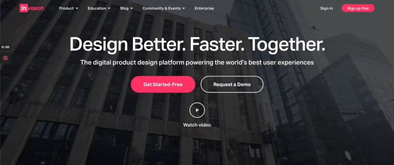
InVision uses an atmospheric video montage with recognizable brands to capture the feel of modern collaboration across digital tools. By intermixing snippets of people, screens and locations, they don’t focus too specifically on any one messaging topic that could lock them in. As a fast-growing company, this approach gives them flexibility to scale their product and positioning without being detrimentally ambiguous. Using video in a header requires decisive editing and compression so it doesn’t slow down the page load time, making this a more challenging approach to do well.
Copywriting: InVision kicks off their website with a short, punchy headline aimed at product designers. They speak to a designer’s desire to not just do their jobs well, but to create a user experience that can perform at world-class levels. This positions their brand as one that helps them achieve not just their goals, but their deeper longing of excelling in their craft in a high stakes environment.
Imagery: By choosing to use video instead of static images in their header, InVision can share glimpses of familiar scenes from a product designer’s world without getting bogged down in any one aspect of the process. We also see logos of globally recognized brands, like Uber, being peppered in for credibility. The seamless transitions and artful feel of the video is unlike a typical “talking head” video, which requires more creative direction and editing to achieve.
Call to Action: “Get Started—Free” and “Request a Demo” are two popular calls to action. “Get Started—Free” is geared at individuals looking to test out their product and scale from lower level tiers. It takes visitors to a simple page with one form field requesting their work email. “Request a Demo” is aimed at enterprise customers and has a more complex form to fill out, along with a tailored list of benefits and recognizable logos for added credibility.
Other Notes: Having once positioned themselves as bringing together two seemingly disparate roles within organizations—designers and engineers—InVision has recently shifted to targeting their primary users alone and speaking directly to them. In doing so, their product line and resource libraries have been vastly simplified to deliver content of greater significance to product designers, allowing them to be more competitive with others in the product design space.